Posiedon
Posiedon
Posiedon
Posiedon
Unifying a design system with more writing and less design
Unifying a design system with more writing and less design
Unifying a design system with more writing and less design
Platform: Posiedon Design System
Platform: Posiedon Design System
Platform: Posiedon Design System
Industry: B2B SaaS
Industry: B2B SaaS
Industry: B2B SaaS
Dated: June 2024
Dated: June 2024
Dated: June 2024
My Role: UI Design
My Role: UI Design
My Role: UI Design
Timeline: 4 Weeks
Timeline: 4 Weeks
Timeline: 4 Weeks
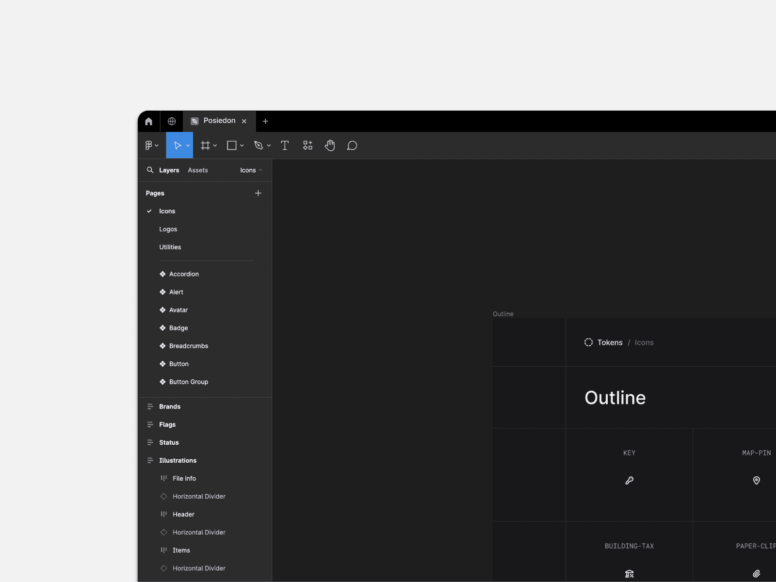
Posiedon, is a full scale Design System owned by Emly Labs, a software design and development agency. The main client base of the company is served by third party businesses looking for tech solutions and software services. Although, Emly were more focused on development side of work, there was a constant effort from the teams to make sure the front end work of their products looks more modern and user friendly.
Emly Labs was planning to overhaul their brand messaging and unify it on all levels based on their end-user feedback and also they were looking for a plan to integrate AI based applications into their solutions. Therefore, there was a definite need for Posiedon to evolve into a new and advanced tool for the whole organization.
Business Goals
Business Goals
Business Goals
To ensure simple and user friendly messaging across the whole design system.
To fill the Accessibility Gaps identified by the research teams.
Pave way for Posiedon to integrate AI into their future projects.
To ensure simple and user friendly messaging across the whole design system.
To fill the Accessibility Gaps identified by the research teams.
Pave way for Posiedon to integrate AI into their future projects.
To ensure simple and user friendly messaging across the whole design system.
To fill the Accessibility Gaps identified by the research teams.
Pave way for Posiedon to integrate AI into their future projects.
What Language?
What Language?
What Language?
As trivial as it may seem, UI is not always a set of colors and fonts put together in a rectangle. It is a much more detailed process.
Therefore, in order to make the experience of the user as seamless as possible, we take into consideration, all the things that comprise a full UI system.
In this case, the language used.
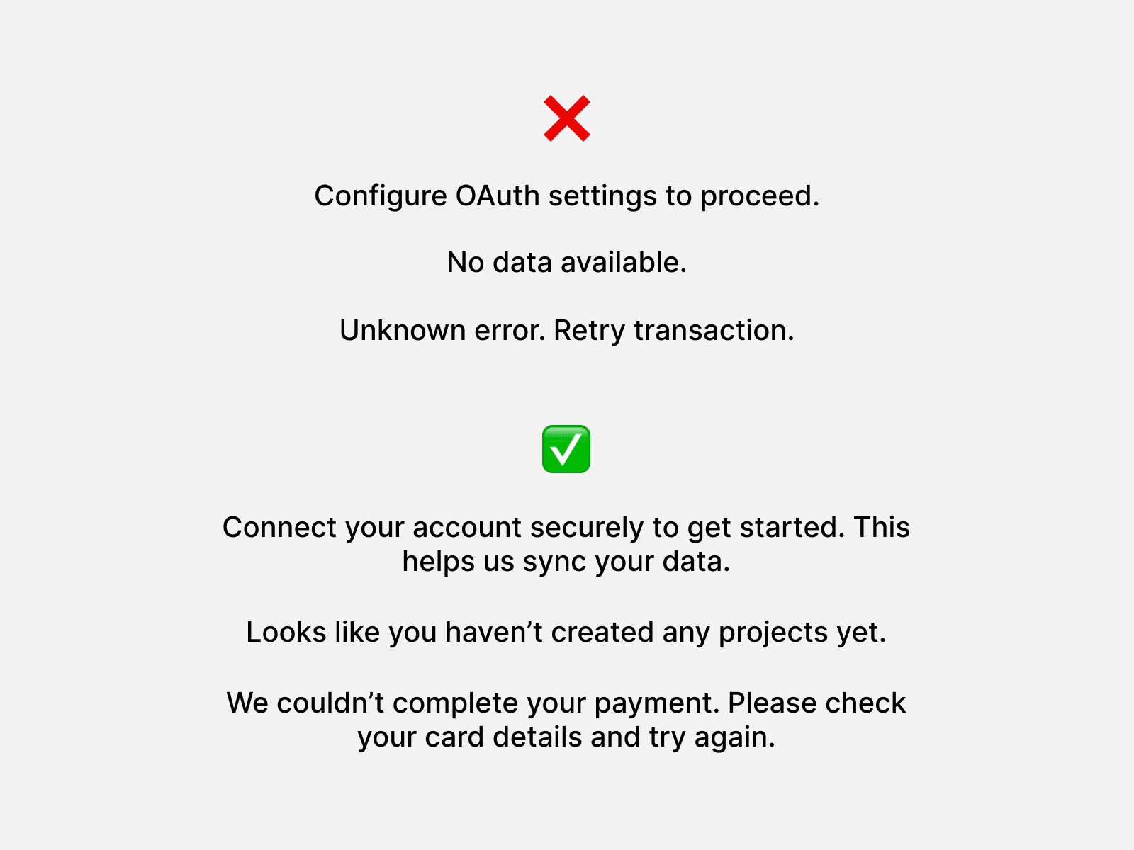
The priority was to fix these vague, technical and direct statements to a bit more user friendly and straightforward one. It was also needed, that the whole design system, and therefore all the final products have a unified and clear UX language.
It was also to be taken into consideration, that this would, going forward, become the brand language of Emly Labs.

Accessibility?
Accessibility?
Accessibility?
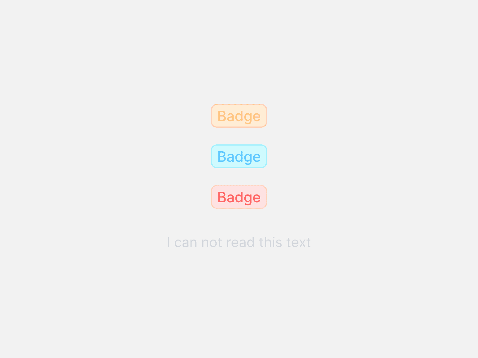
The system color palette was NOT made according to WCAG principles. Although there was not a lot of the components that were limited on accessibility, there sure was a lot we could achieve if I adjusted the color Primitives and Semantics a little.
The system color palette was NOT made according to WCAG principles. Although there was not a lot of the components that were limited on accessibility, there sure was a lot we could achieve if I adjusted the color Primitives and Semantics a little.
The system color palette was NOT made according to WCAG principles. Although there was not a lot of the components that were limited on accessibility, there sure was a lot we could achieve if I adjusted the color Primitives and Semantics a little.
Make it simple?
Make it simple?
Make it simple?
The design system was already in use, the engineering teams were using it to make products, so what could make this design system a little more simpler and easy to implement?
The answer is, Documentation.
Posiedon lacked a clear description of its components and how someone who is not technically abled like a UI Designer, can read it and properly implement it. It was on priority to make sure the engineering teams understood how each component worked and like the language it also had to be done to ensure that Posiedon is well maintained going into the future.

How might we?
How might we?
How might we?
How might we unify the messaging across the design system and provide clear guidelines for our users, while improving accessibility and best practices for present and future integrations?
How might we unify the messaging across the design system and provide clear guidelines for our users, while improving accessibility and best practices for present and future integrations?
How might we unify the messaging across the design system and provide clear guidelines for our users, while improving accessibility and best practices for present and future integrations?
Client Pain Points
Client Pain Points
Client Pain Points
Messages are too vague, technical and inconsistent.
Messages are too vague, technical and inconsistent.
Messages are too vague, technical and inconsistent.
Alerts are too hard to differentiate.
Alerts are too hard to differentiate.
Alerts are too hard to differentiate.
Can not read the text on badges.
Can not read the text on badges.
Can not read the text on badges.
Have to re-check after performing an action.
Have to re-check after performing an action.
Have to re-check after performing an action.
Client Needs
Client Needs
Client Needs
The UX language needs to be a little more simple and more informative.
The UX language needs to be a little more simple and more informative.
The UX language needs to be a little more simple and more informative.
The alert notifications need to be more definitive in terms of their state.
The alert notifications need to be more definitive in terms of their state.
The alert notifications need to be more definitive in terms of their state.
WCAG Accessibility is Priority One.
WCAG Accessibility is Priority One.
WCAG Accessibility is Priority One.
Need to add a pop up component.
Need to add a pop up component.
Need to add a pop up component.
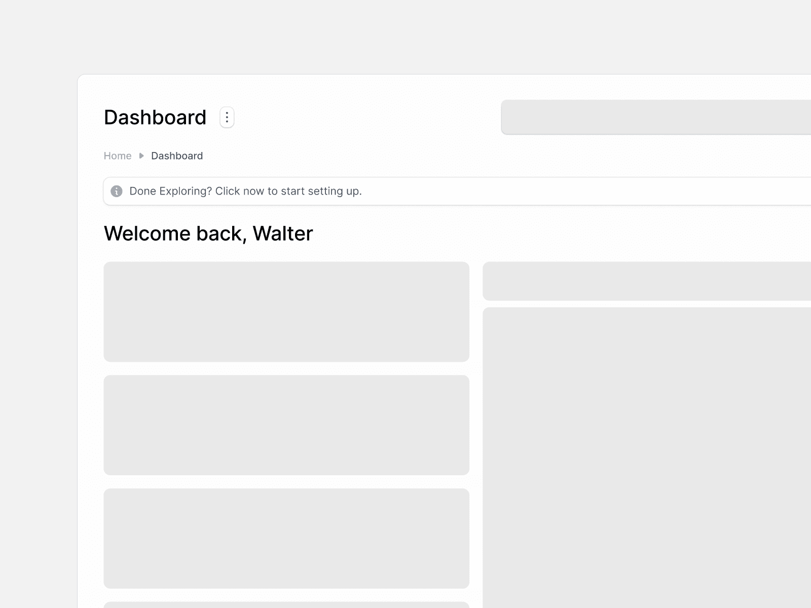
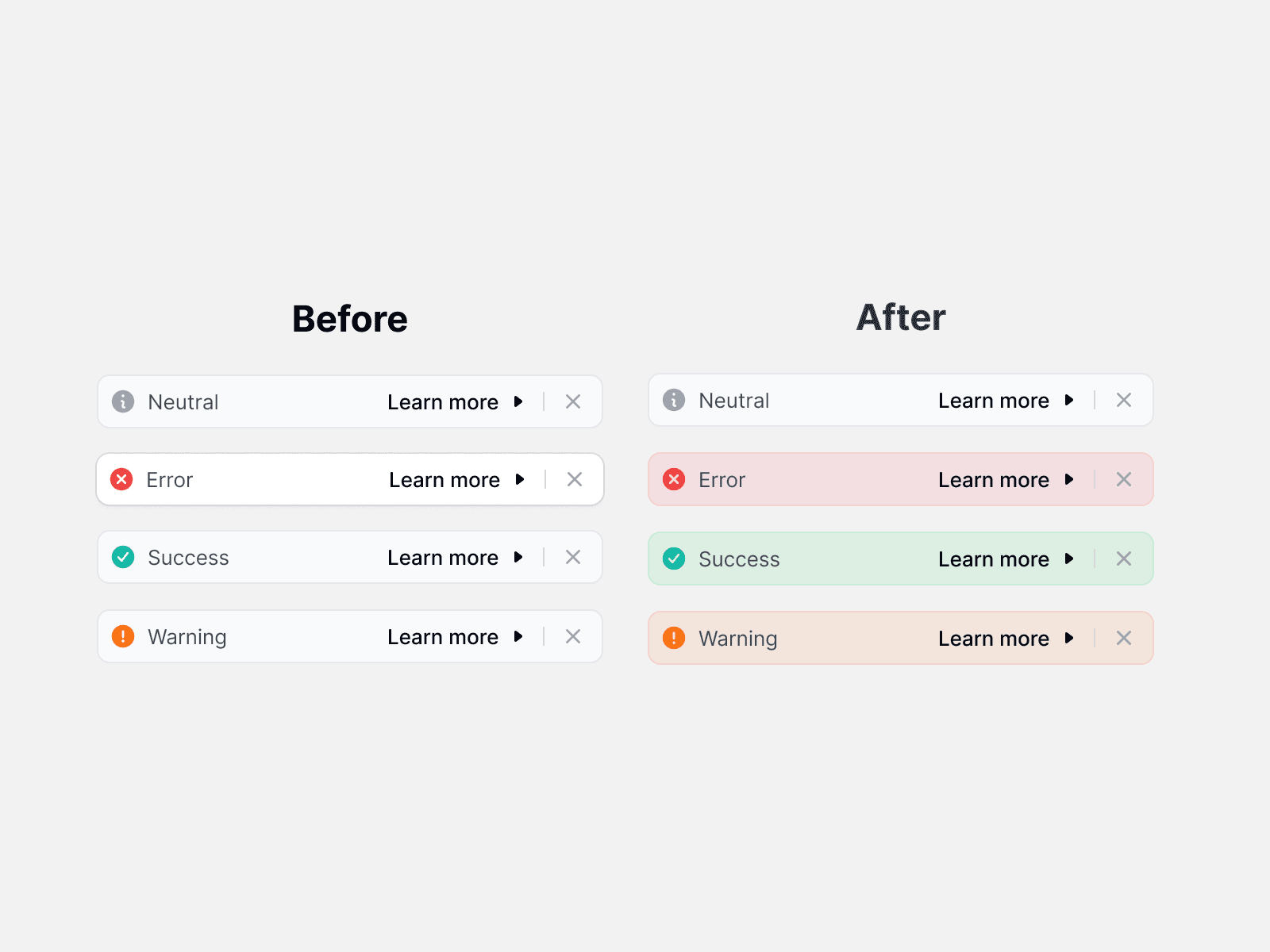
Looking at the image below, it would be hard to figure out the state of the alert unless the User reads it. Therefore, changing its priority.
Suppose you get an error and you ignore it because it did not feel so critical to you, it will disrupt the experience and hence it needed to be changed.
Looking at the image below, it would be hard to figure out the state of the alert unless the User reads it. Therefore, changing its priority.
Suppose you get an error and you ignore it because it did not feel so critical to you, it will disrupt the experience and hence it needed to be changed.
Looking at the image below, it would be hard to figure out the state of the alert unless the User reads it. Therefore, changing its priority.
Suppose you get an error and you ignore it because it did not feel so critical to you, it will disrupt the experience and hence it needed to be changed.
Fixing the old.
Fixing the old.
Fixing the old.
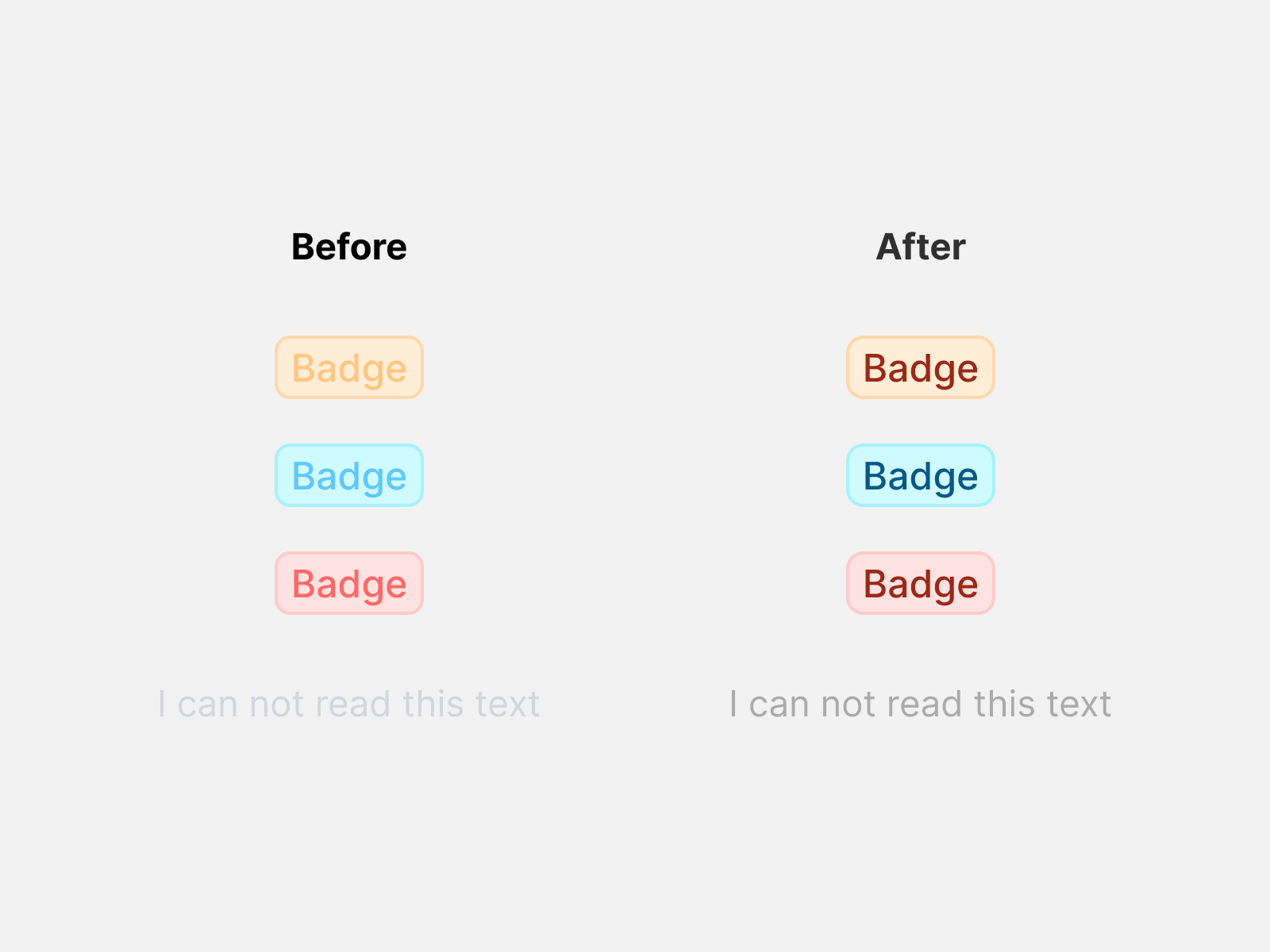
The accessibility was priority one, but it was easy to fix because of Posiedon's detailed token library.
The accessibility was priority one, but it was easy to fix because of Posiedon's detailed token library.
The accessibility was priority one, but it was easy to fix because of Posiedon's detailed token library.
I just replaced the color values and adjusted the semantics so that the system was adhere to a WCAG 2.1 compliance.
I just replaced the color values and adjusted the semantics so that the system was adhere to a WCAG 2.1 compliance.
I just replaced the color values and adjusted the semantics so that the system was adhere to a WCAG 2.1 compliance.
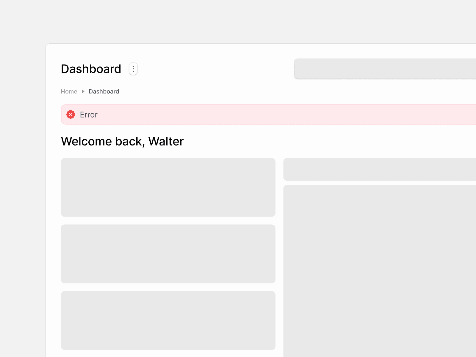
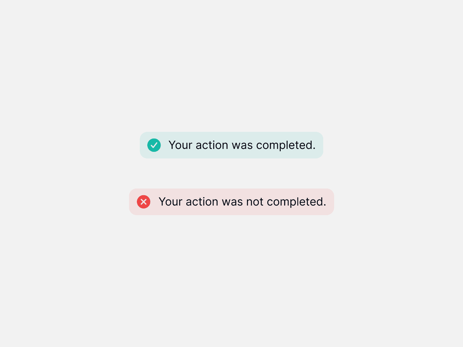
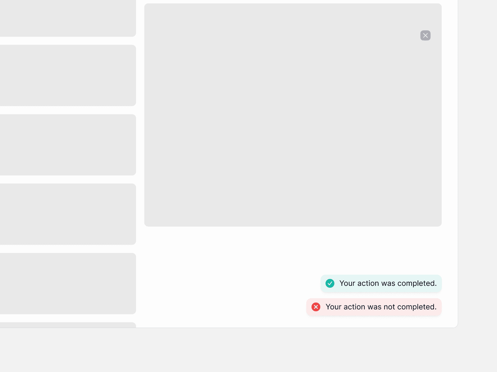
We also changed the alert components to fit the state they were in. Differentiated by colour with respective to their destructive, success, information, warning or neutral state.
We also changed the alert components to fit the state they were in. Differentiated by colour with respective to their destructive, success, information, warning or neutral state.
We also changed the alert components to fit the state they were in. Differentiated by colour with respective to their destructive, success, information, warning or neutral state.
Creating the Messaging Guidebook
Creating the Messaging Guidebook
Creating the Messaging Guidebook
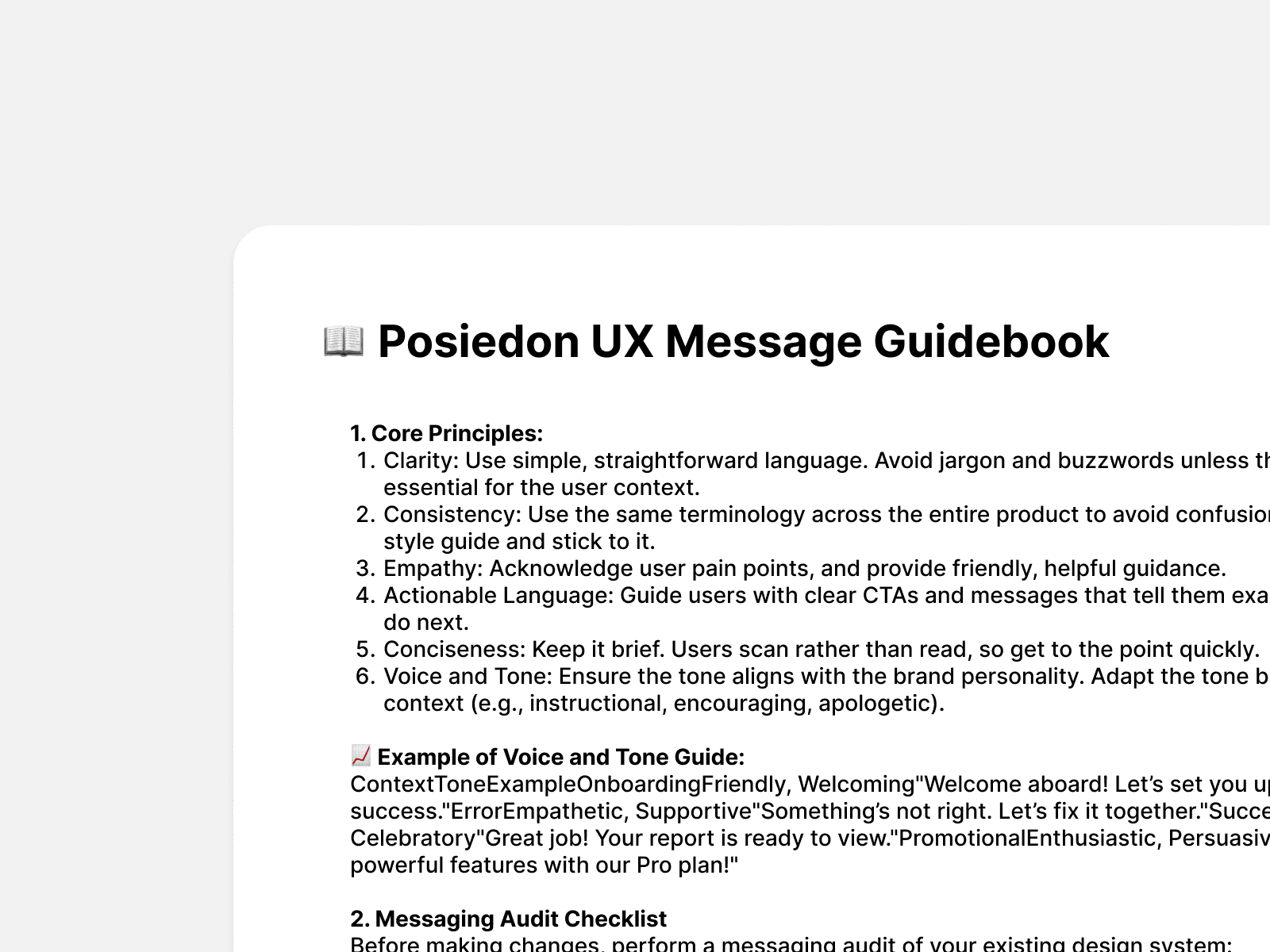
I figured there was not a one time fix for all this. As the Design System grew, there would be an absolute need for the teams to unite on a single framework. Therefore, I created a set of rules, that I implemented across the whole design system.
The language was based on the core principles of Clarity, Empathy, Consistency, Actionable Language and a tone that resonates with the brand voice of Emly Labs. A guidebook, set to pave the path to future project work.
Creating new components.
Creating new components.
Creating new components.
The components in order was something to inform the user that an action has been completed or failed.
The components in order was something to inform the user that an action has been completed or failed.
The components in order was something to inform the user that an action has been completed or failed.
Problem
Problem
Problem
Have to re-check after performing an action.
Have to re-check after performing an action.
Have to re-check after performing an action.
Solution
Solution
Solution
Need to add a pop up component.
Need to add a pop up component.
Need to add a pop up component.
Looking at the image below, it would be hard to figure out the state of the alert unless the User reads it. Therefore, changing its priority.
Suppose you get an error and you ignore it because it did not feel so critical to you, it will disrupt the experience and hence it needed to be changed.
Looking at the image below, it would be hard to figure out the state of the alert unless the User reads it. Therefore, changing its priority.
Suppose you get an error and you ignore it because it did not feel so critical to you, it will disrupt the experience and hence it needed to be changed.
Looking at the image below, it would be hard to figure out the state of the alert unless the User reads it. Therefore, changing its priority.
Suppose you get an error and you ignore it because it did not feel so critical to you, it will disrupt the experience and hence it needed to be changed.
Documentation
Documentation
Documentation
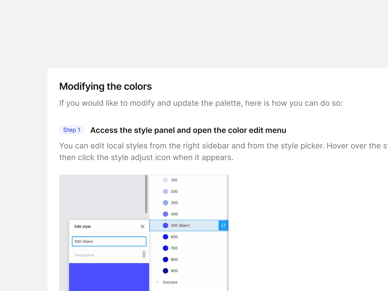
The documentation was the perfect pathway between designers and the rest of the team. The main focus was to prioritize east implementation of all components all the while making the design system easy to navigate and use.
The documentation was the perfect pathway between designers and the rest of the team. The main focus was to prioritize east implementation of all components all the while making the design system easy to navigate and use.
The documentation was the perfect pathway between designers and the rest of the team. The main focus was to prioritize east implementation of all components all the while making the design system easy to navigate and use.
The documentation was kept educational for all the variables and components, listing all the use cases and API usage is seamless.
The documentation was kept educational for all the variables and components, listing all the use cases and API usage is seamless.
The documentation was kept educational for all the variables and components, listing all the use cases and API usage is seamless.
Future plan
Future plan
Future plan
With the introduction of AI and machine learning tools the inclusion of AI in UI and Design Systems is going to be a game changer.
With the introduction of AI and machine learning tools the inclusion of AI in UI and Design Systems is going to be a game changer.
With the introduction of AI and machine learning tools the inclusion of AI in UI and Design Systems is going to be a game changer.
Emly Labs is also keen on introducing AI based components into their design system. Although it would be a big learning curve for all of us, there will be a huge pay out at the end of it all.
Emly Labs is also keen on introducing AI based components into their design system. Although it would be a big learning curve for all of us, there will be a huge pay out at the end of it all.
Emly Labs is also keen on introducing AI based components into their design system. Although it would be a big learning curve for all of us, there will be a huge pay out at the end of it all.

The future plan also incudes a Dark Mode Design System in parallel to the already functioning one.
The future plan also incudes a Dark Mode Design System in parallel to the already functioning one.
The future plan also incudes a Dark Mode Design System in parallel to the already functioning one.
Conclusion
Conclusion
Conclusion
The project lasted a total of 4 weeks, with a full stack engineering team in the loop. The design decisions implemented were tested against the working teams of Emly Labs and also the end user. Unfortunately the test data was preserved under an NDA because of privacy reasons.
The future holds an exciting arc of transition into the future of products as a service, with the integration of AI into the norm.
The next venture for me and Emly Labs is the AI ChatBot. Stay Tuned! :)